
Campus Sutra is a vibrant Indian e-commerce fashion brand, deeply rooted in youth culture, offering trendy and affordable apparel. They cater primarily to college students and young professionals across India, available on major platforms like Myntra and Amazon, as well as their own website.
🎯 Brand Positioning: Affordable, stylish, and campus-friendly fashion that reflects individuality
🎓 Target Audience: Primarily college students and young professionals
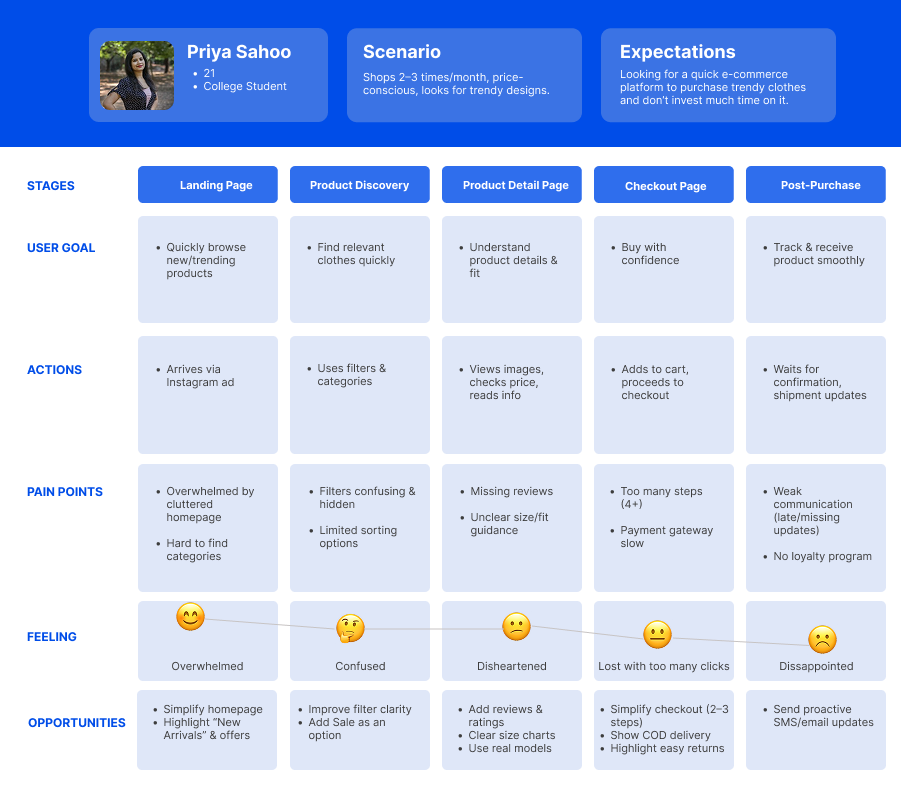
They were facing a big challenge on their own website. Only 2.5% of their website visitors were converting into customers. This was a huge business problem, especially since 70% of their traffic was coming from mobile devices. Our opportunity was to use data-driven UX to enhance their shopping experience.
High cart abandonment (70%), poor product detail engagement, and friction in the checkout process led to significant drop-offs.
I served as a Product Designer for this project, leading the end-to-end design process from research through high-fidelity prototyping. I collaborated closely with a cross-functional team. This project began when the product manager shared key insights, giving us the freedom to research and develop our own solutions. Increasing our sales through our website.

We conducted in-person user interviews and deep dives into shopping behaviors. We asked critical questions: 'Which platforms do you use and why?', 'What's your process for finding clothes?', 'What information do you need on product pages?', and most importantly, 'What frustrates you most about checkout?'
On a high level, we covered different aspects and gathered their feedback.
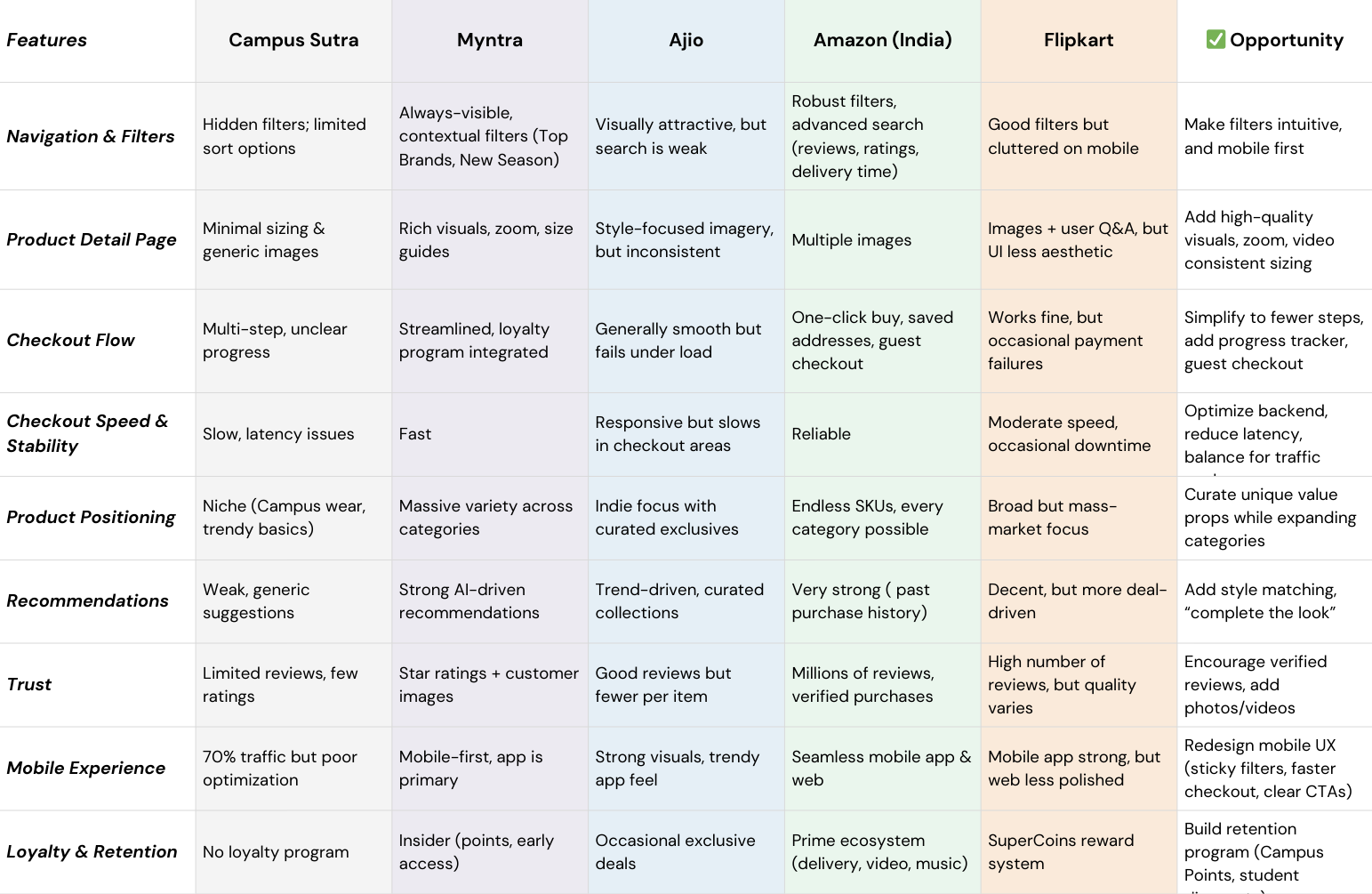
To validate our findings and identify opportunities, we conducted competitive benchmarking against key players. This confirmed our hypotheses:
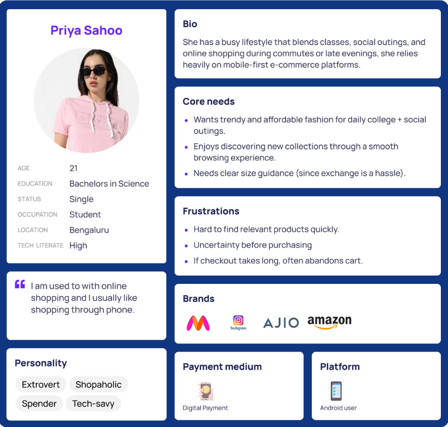
We created our user persona "College Shopper Priya, 21," who seeks trendy, affordable styles and shops 2–3 times a month. She currently faces trust and transparency issues due to the lack of reviews, delivery timelines, and return policy information. She wants a simpler, more reliable journey with relatable product visuals.
For the upcoming product phase, the focus should be on delivering core functionality and a seamless user experience. Must-have features include clear delivery information and reviews with size clarity, which are critical for building user trust and reducing purchase friction. On the strategic front, implementing advanced filtering and navigation tailored by category, along with support for multiple payment gateways. However, features like a personalization engine and gamification elements similar to Temu should be avoided or deferred for now, given their complexity, high implementation costs, and limited ROI at this stage of growth.

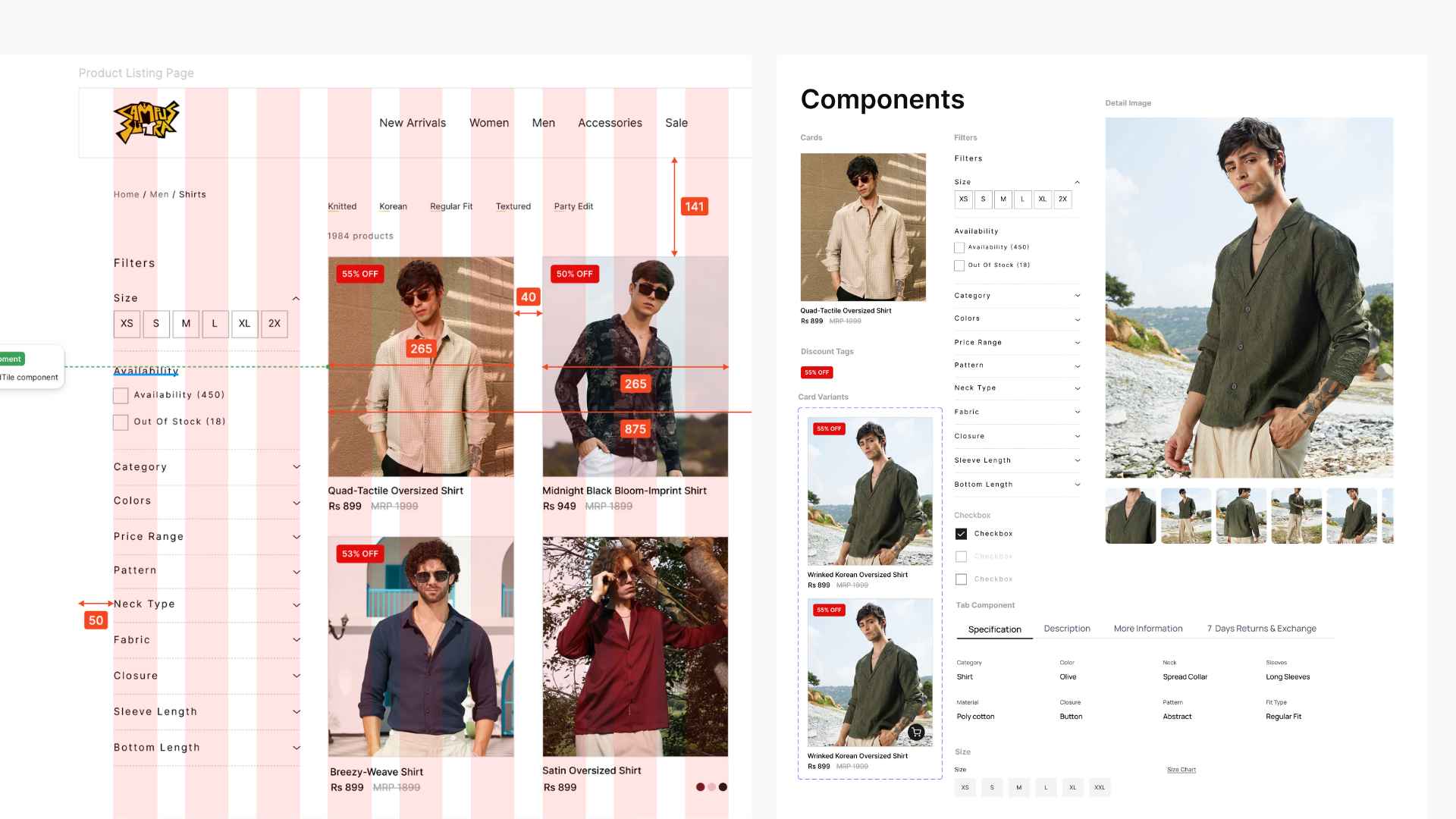
To get started, I designed a few low- to mid-fidelity wireframes exploring different filtering approaches. Initially, in Design 1, I used a more traditional method with static checkboxes for filtering. Moving to Design 2, I implemented auto-applied filters with clearer categorization for a more streamlined experience. Based on feedback from that version, I iterated further and created Design 3, which features a collapsible filter panel—this significantly improves usability, especially on mobile devices, as it reduces the need for excessive scrolling.
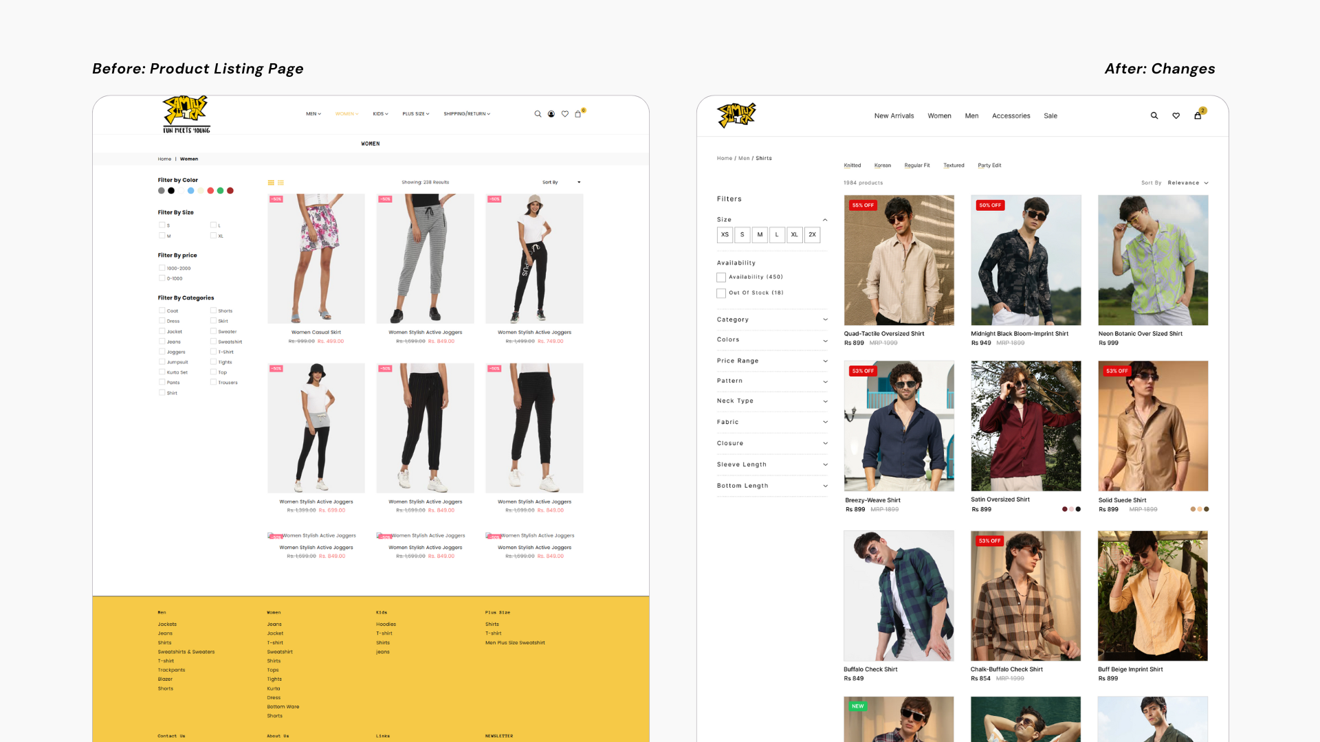
I began by redesigning with Product Details page, which featured vertically scrolling images in a more editorial-style layout. While the internal team appreciated the visual appeal, the feedback highlighted a challenge: it was difficult to compare multiple angles of a product simultaneously. In response, I explored designs using a tile-based preview approach.
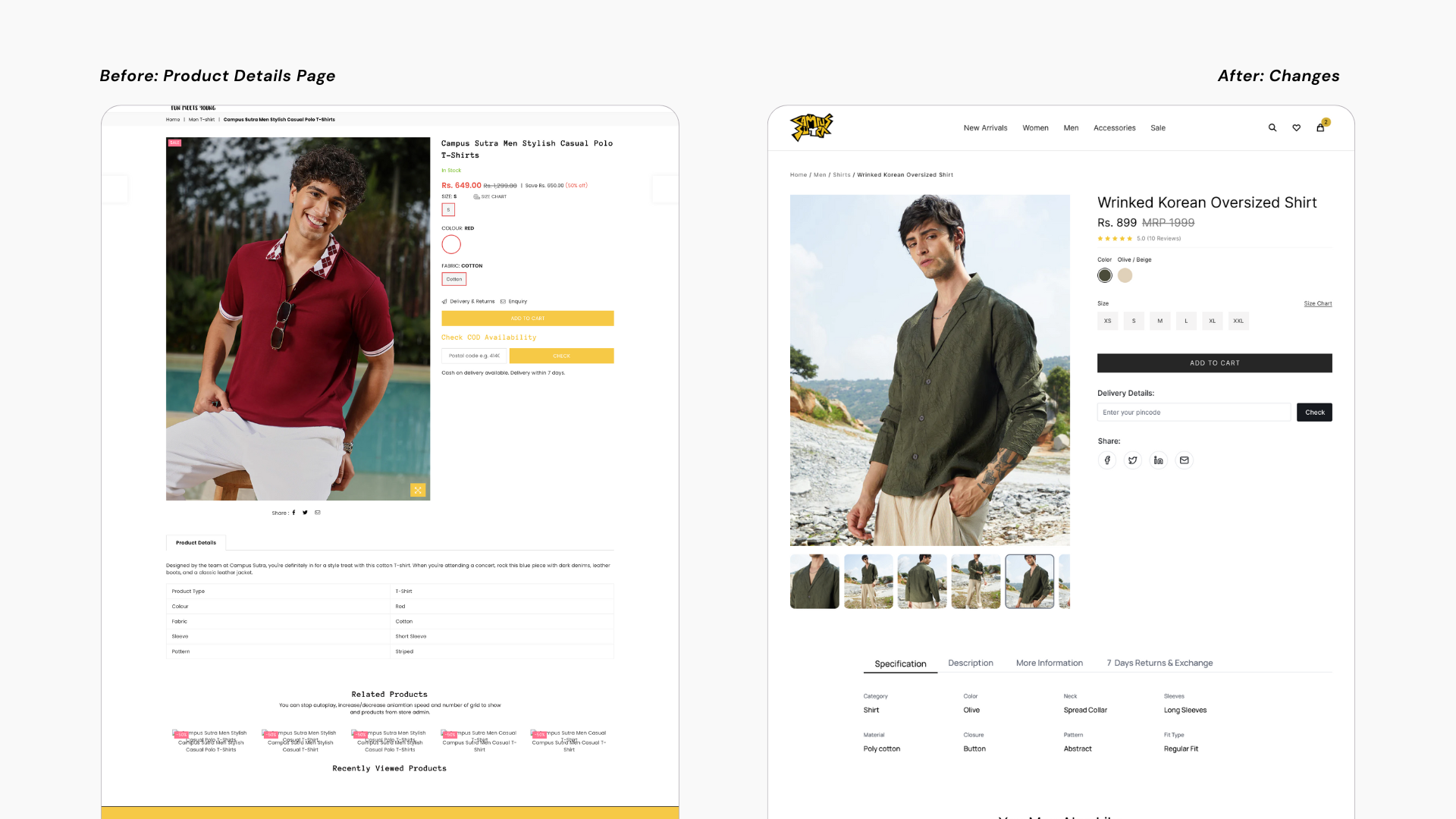
But throughout the redesign process, I contributed significantly by building key UI components from scratch; this included creating card variants, filter panels, tab components, and custom checkboxes. These components not only supported the new design directions but also laid the foundation for a more scalable and consistent design system.
We conducted an A/B test to evaluate the performance of our redesigned interface. We focused on core UX metrics such as Task Completion Rate, Time on Task (Efficiency), Error Rate, and User Satisfaction, both qualitative and quantitative.
Stakeholders noted that the clear UX vision helped align the team and even influenced our development priorities.
13%
improvement from version A to version B
5%
decrease from 15% to 5%, indicating fewer user mistakes, and a smoother interaction experience.
70%
Users preferred Version B, specifically mentioning easier product discovery as a major improvement.


