Like my profile. Let's have a quick chat.

Toothlens is a mobile dental health app that empowers users to assess their oral hygiene using their smartphone camera. Powered by advanced computer vision, the app delivers insights on cavity risk, tartar buildup, gum health, and more, eliminating the guesswork and fear around dental visits. This case study illustrates how we transformed a complex and traditionally clinical dental process into an approachable, user-friendly mobile experience. Our goal was to increase user awareness and encourage proactive oral care through intuitive design and smart technology.
As the UX Designer, I led the design from discovery to delivery, contributing to:
I collaborated with different parts of team:

Designing Toothlens presented several UX and usability hurdles, especially in a domain as sensitive and unfamiliar as at-home dental scanning.
We followed a design thinking process to define the core problem, uncover user needs, and rapidly prototype solutions.
The project began with a kickoff meeting with stakeholders, including engineers and product leads, to understand the vision, tech capabilities, and business goals.
We interviewed target users and developed personas to capture behavioral patterns. One key persona, Sarah Nesbitt, reflected users with a history of dental issues who wanted real-time feedback between dental visits.
"A tooth scanner would give me some relief between visits."
"I barely have time to floss, so I need something quick to check if my dental health is okay."

30 yrs old | San Diego, California | Digital Media Manager
I conducted a heuristic evaluation against Nielsen’s 10 usability principles. Major usability issues included:

We created low-fidelity prototypes focused on three core tasks:
Introduced the app’s purpose and features across three simple, visual screens. Users then created profiles to customize results.
The heart of the app. The homepage included a progress bar and risk-level indicator. We focused on step-by-step instructions to guide users through scanning all tooth regions. The interface displayed results clearly, with red/yellow/green indicators and friendly explanations.
Users could instantly schedule a follow-up with a dentist if issues were detected. A streamlined booking flow was added with access to calendar, payment, and doctor profiles via a sticky nav bar.

The onboarding flow eased users into the experience with friendly, non-technical language. We broke down the value of scanning into digestible bits, reducing apprehension. The scan interface showed a real-time progress bar and step prompts. We added a feedback system with indicators for proper alignment and color-coded results.
Redesigned flows now:

The scan interface showed real-step prompts (e.g., "Now scan your lower molars"). We added a feedback system with indicators for proper alignment and color-coded results.

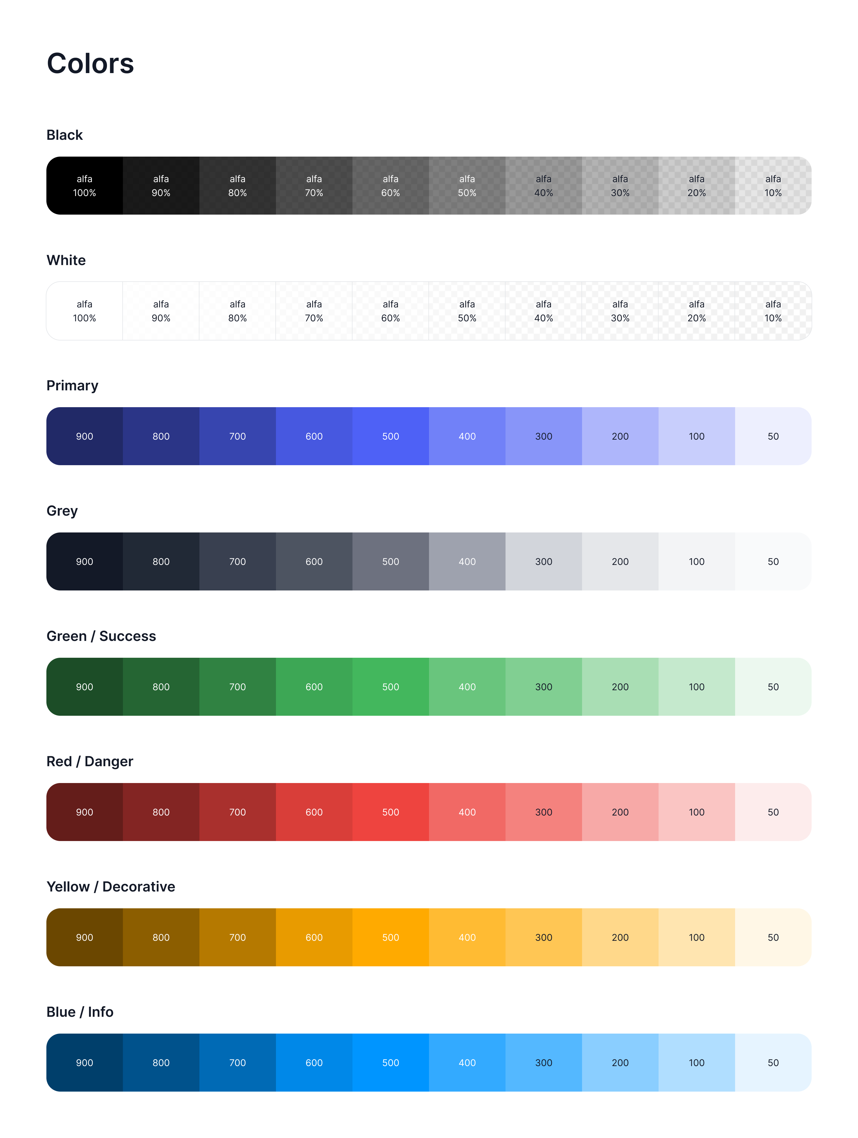
We followed a design system to maintain consistency across our platforms. The app design emphasized comfort, clarity, and credibility. Soothing blues and mint greens evoked clinical trust and freshness. Clear call-to-actions helped reduce decision fatigue. These decisions ensured that a tech-heavy, health-centric app felt human and intuitive.

We embedded a smart scheduling flow, where users could book a dentist visit if their report flagged high-risk zones. Filters included insurance, distance, and availability. We also revamped our onboarding flow to ease users into the experience with friendly, non-technical language.

Even before live deployment, design validation showed strong user traction:
These early metrics highlighted the value of clear flows, trust-centered UX, and responsive iteration.
Working on Toothlens offered deep insights into designing for healthcare and unfamiliar tasks. Key takeaways include:
45%
in user engagement, as users found it easy and convenient to assess their dental health from home.
10%
increase by conducting user testing and heuristic evaluations, which helped in refine the scanner’s interface.
Users could book consultations, though the user flow was smooth. However, it lacked some basic key usability principles.